Back story: the data journey in the production of the GP pressure map
This is a guest post by Leo Valberg, Senior Data Scientist at Nquiringminds. This post was originally published on the Nquiringminds blog. The Open City Data Platform is one of the initiatives the Hampshire Hub Partnership is involved with.
#1 The Overarching Mission
Thinking ahead to April when the FutureCites contract to build a data integration platform starts, the team thought a blog would help to serve as a record of how the project is progressing.
Our central plan is to build on to the ubiapps easy drag and drop platform. This is a secure data integration and visualisation tool that will allow users to construct their own dashboards, using static and real time, Internet of Things data and then at the click (or two) of the button deploy them to their website. Our aim is to use the contract to boot-strap an open source repository of data harvesting, processing, analytic and visualisation tools. These will then allow administrators, elected officials, businesses and citizens the ability to make maximum use of the disparate and often inaccessible “open” data. We champion the notion of extracting value by bringing together data for operation management, strategic decisions and governance transparency.
Over the coming months we will write about our decision processes, what data models we chose and why, as well as what methodologies and data sources we decided to use for our metrics. We will also discuss what services and tools we felt would best meet demand.
We welcome anyone who is interested to join the conversation- by questioning our decisions, telling us about other options and generally helping us to build the best open data visualisation and analytics tool possible.
We will follow this post with one or two example visualisations that we will produce before we start the project proper.
#2 GPs under pressure
Following on from this we wanted to create an example of the types of displays that we hope people will be able to easily build once the Open City Data Platform is up and running.
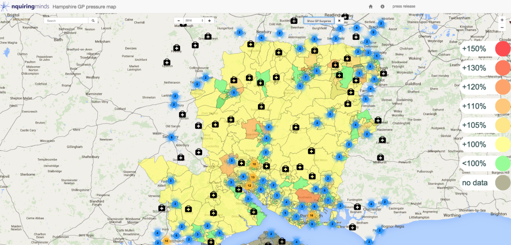
To demonstrate this, we built a heat map to show which areas in Hampshire over the next few years would see increases in demand for GP services. One of our initial partners is Hampshire County Council and we wanted to do something interesting with the data available on the excellent Hampshire Hub. (All the data sources used can be found here.)

We found the linked data to population structures from the 2011 census and the boundary data for the geographic areas. As a crude first estimate for forecasting the population, we aged the population and subtracted the compounded average mortality for the age and sex group, and kept the birth rate constant.
An internet search for average GP visits yielded QResearch’s survey of consultation rates by age and gender. These were from the year 2009.
QResearch have interpolated points between surveys, and there is a general trend of increasing numbers of visits for all ages and both genders. While it would be possible to extrapolate this out to the present and future dates, under the principles of keeping it simple and conservative we stuck to the latest hard data from 2009. However it should be said that it is very much part of the future plan, to make it easy to compare different consultation rates using different models, extrapolations and even the effect of new policies such as flu vaccinations or changes to mental health policy.
After showing an early version of the app to several people from the facts and figures team at Hampshire County Council (HCC), they pointed me to the council demographers’ population forecasts, which run out to 2020. Their models are based on death rates, birth rates and migration in and out or existing housing stock as well as migration into new stock, estimated from the planning registration database. If you look at the areas that see large increases in demand for GP services this is usually driven by population growth from new housing.
The HCC population forecasts are given for Lower Super Output Areas (LSOA). LSOAs are geographic boundaries that contain approximately 3000 people (between 2000 and 4000). We ar currently looking at the best tools to map and aggregate these geographic statistical entities and plan to blog about that soon (comments and advice welcome).
We pulled the geographic boundary data from the Hampshire hub for each LSOA in Hampshire as feature GeoJSONs. We then aggregated them in to one feature collection and loaded them onto a google map using the API. This is about 4MB of data that gets sent to the client when they open the map. This is not the most efficient mechanism, and we will improve this later
Finally we summed the total number of consultations for each LSOA by multiplying the forecasted population for each age gender group by the expected number of consultations for that group.
The colours on the map for each LSOA reflect the ratio of the total consultations for the year against the total consultations for 2015. So the map can be read as the increase in demand for each area.
This example is meant to show what is easily possible with the right tools. While we wanted it to be simple we also plan to add some additional functionality for further insights. Any suggestions or requests beyond the list below would be greatly appreciated.
Firstly as I said before, we intend to add the ability to change the consultation model. This will include being able to input a formula, to extrapolate the consultation rates. Also the ability to dial up or down the consultation rate for a specific demographic group, to show the expected impact of a new health initiative. For example the effect of an advertising campaign for flu jabs. What for example is the impact of free health checks, such as those being advertised, see below:
 Secondly the ability to drag and drop new housing stock with specified demographics onto the map, to see the effect on demand. We also intend to add the capacity to have more control over the demographic modelling process, using other data sources to tailor the forecast for specific areas.
Finally, and possibly the most important, a mechanism to define how to distribute the demand from the LSOAs to the local surgeries.
This is an early illustrative example only. Not only can the GP specific model be improved, but the general Supply vs Demand predictive model will extrapolate to other resources: hospitals, fire departments, schools etc.
For us this is collaborative exercise and we actively encourage criticism, suggestions for improvements, suggestions on similar challenges, and of course people needing help applying such methods to their own areas. Please feel free to contact us on [email protected]
Leo Valberg
Senior Data Scientist, nquiringminds