Visualizing Open Data’s Global Reach
This article is cross-posted from the Blue Raster Blog.
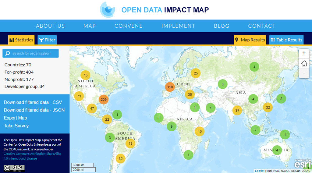
Blue Raster worked with the Center for Open Data Enterprise to build a mapping application showcasing a centralized, searchable database of organizations using open data worldwide. The Open Data Impact Map makes it possible to explore open data-use trends through filters and visualizations and is facilitates comparative analysis by country, region, or company use of data. All information collected becomes publicly available as a resource for others to build on.

“All of us at the Center for Open Data Enterprise are pleased to have worked with Blue Raster on the Open Data Impact Map. Their engaging, user-friendly visualization will help make this an excellent resource for the open-data community worldwide. We’re looking forward to continuing to work with Blue Raster…”
Joel Gurin – President, Center for Open Data Enterprise

The web map was developed in Leaflet using React, Backbone.js, Dojo, Modernizr, Underscore.js and jQuery javascript frameworks. ZURB Foundation was used as the web framework.
Check out the site and see how dynamic clustering is used to visualize open data around the world.